
It’s that time again !
The Euros are over, England are out of Europe in every possible sense, so what better way to take your mind off it all by paying through the nose for an over-priced garish scrap of nylon to cheer you up for a few weeks before you inevitably settle for mid-table mediocrity and the hope of a decent cup run.
Let’s just hope the latest bit of old tat on offer at the club shop isn’t made by Puma …
THE INSTANT CLASSICS
Every year, there’s a swathe of retro-looking kits that tap into the nostalgia market allowing several generations of the same family to wear their team’s colours and stride proudly to the ground thinking of the good old days.
Of course, nostalgia isn’t what it used to be and while Everton and West Brom can actually look back fondly on the 80s, the best Chelsea fans can do is to imagine Kerry Dixon running out in this season’s rather fetching new kit (at his fighting weight though, as I doubt he’d be able to squeeze into one of the official first-team versions) :

Over in the red corner, Barnsley haven’t just rejigged the shirt : they’ve gone back to the 50s with matching hooped socks. Sunderland look like they’ve just had a rummage through Stoke’s boot-room from last year for their new strip but it does look good with the gold trim. Charlton keep it nice and simple with an effort that might have been drawn in crayon by a talented 10-year old :

Sticking with the children’s art class look, here’s the new Linfield strip from Umbro, who are steadily building up their business following a split from Nike :
 Over in Europe, three of the biggest names have jumped on the retro bandwagon with Stuttgart rocking the classic red stripe over white, with a classy sponsor on board too while compatriots Hamburg evoke the Kevin Keegan era with their latest number. Italian club Bologna are as stylish as ever in their bold new thick-stripe design, temporarily ditching their more traditional halves though retaining a simple retro feel in doing so :
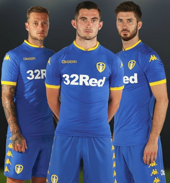
 Yorkshire giants Leeds United are another club to abandon their roots by opting for blue over yellow for this season’s second strip, another boldly classic uniform :
 TEAM PYJAMAS
What were they thinking ?
Sometimes the designers get it so wrong it’s laughable. I’m sorely tempted to check out the sleepwear section of the club shops to find out if they just mixed up the templates when they churned out this little lot …
First up are Liverpool with an effort that actually looks more like a cut-up onesie than a football kit. South London self-styled hardmen Millwall will look a lot softer running out in this cute combo, while the only thing that springs to mind when you see the new Hearts away kit is those fruit salad chews :
 The next nightmare selection includes Bournemouth‘s almost-a-sailor suit, QPR‘s weird claret and amber romper-wear and Wigan‘s so-tight-they-must-be-long-Johns childishly simplistic striped affair :
 Bringing up the rear complete with bed-head hair and their thumbs in their mouths are Besiktas’ “can we be like Man U ?” rip-off, Celtic‘s over-priced spa outfit and Man United‘s very own new home kit with a bizarre hexagonal border separating two chunky shades of red. At least that nice Memphis Depay and his chum Jesse Lingard seem to like them :
 NOT FADE AWAY
As textile technology becomes ever-more expansive, so too does the range of options available for the manufacturers. Last season saw a smattering of innovative new club kits featuring colour fades for the first time. Though still a seemingly minor development in terms of the number of designs, expect to see more of these in the coming years as teams look to stand out from the crowd.
Coventry City are one club bolding taking the bull by horns by having both home and away strips adopt the colour blend, the resulting away shirt being eerily reminiscent of their infamous brown Admiral kit from the late 1970s. French club Nancy use the same Nike template but partner the red with white, while Swansea introduce an interesting take on the double-blue look – as favoured by Coventry in the past – for their second strip :

Coventry’s home shirt is in fact a reverse of the blue and white Nike template favoured by both Hartlepool and Kilmarnock for this season’s home shirts :
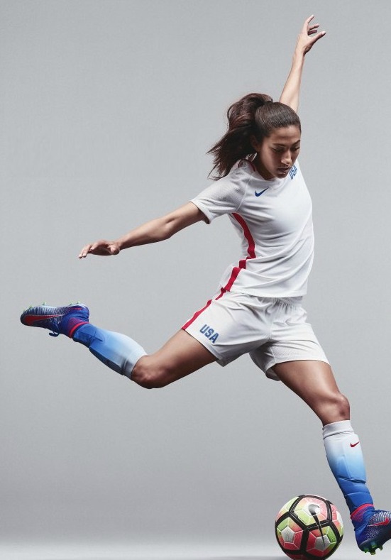
 Perhaps the finest example of a fade is the US Olympics strip, which uses the technique very subtly by just employing it on the socks to bring a dash of elan to an otherwise fairly plain kit, lifting it from the non-descript to the quietly stylish :
 POLOS AND PINSTRIPES
Football is not golf and neither is it the stockmarket, so why do kit manufacturers continue to produce polo shirts and piss about with pinstripes ?
I hate polo shirts. Period.
Either wear a t-shirt or a collared shirt, not some freak hybrid of the two. You don’t see women wearing high-heeled trainers .. oh no .. wait, those are actually a thing now, aren’t they ? Okay, but we’re talking about football. Shiny shirts. Nylon. Nipple rash and stretched beer bellies. Not loose-fitting brushed cotton and distressed finishing. Not bespoke tailoring and cufflinks.
Just offer a proper polo in the club shop for anyone who wants to wear one and maybe a subtly crested formal shirt along with matching tie and .. er .. cufflinks with the club badge on them.
Do not mix and match …
Take this little lot, for starters : Bayern should hang their heads in shame for making their proud, beer-swilling fans wear this monstrosity with their lederhosen. Motherwell‘s shirt actually has moobs ! Villa‘s looks like a children’s library club uniform, while Saint Etienne‘s away kit couldn’t be any more pastel if it was sponsored by Rowntrees :
 Their home shirt is even worse ! How can you screw up such a classic kit ? Gone are the days of Rocheteau and Platini .. now it’s more evocative of a caravaning couple in their 60s. I wonder if the shorts have an elasticated waist and they wear velcro boots ? Actually, all football shorts have elasticated waists, but you know what I mean ..
The mighty Real Madrid are actually charging £60 for their latest bit of tat, and that’s just the basic replica jersey. For £90, you can buy the same shirt but in the tighter “first team cut” design known as the “adizero” .. or you could go to Primark and buy fifteen white polo shirts for the same money. They’re probably made in the same factory anyway.
At least Watford‘s playsuit, I mean new shirt, is shiny like a proper football kit. And it has nice press-studs instead of those awful fiddly buttons or – heaven forbid – a traditional v-neck collar. Fiorentina‘s once beautiful home shirt is now so disgustingly lazy that’s all I have to say about it :
 The final word on polos goes to my own beloved Leeds United, and that word is why ?

There’s retro, there’s vintage, there’s timeless .. then there’s dated and obsolete.
Step forward, Mr Pinstripe.
I hate them, too. They’re an aberration, an abhorrence and an eyesore that should never be allowed to adorn a football shirt.
Three of the continent’s biggest clubs have piddled around with what were previously iconic designs to come up with something needlessly different and just look at them : PSG‘s gloriously unique kit relegated to a leotard, BMG‘s ridiculously bonkers white-black-green combo is now overly fussy and resembling a bar-code, while AC Milan have shredded their suave black and red stripes by actually shredding the ends of the damned things. The result looks more like something from a zombie movie, with blood dripping slowly down from the severed torso of Paolo Maldini :
 Back in Blighty, things are no better. Aberdeen have meddled with a design classic to bring us that rarest of beasts : the pinstriped polo, and boy is it hideous. Wolves have actually recycled a strip from 1985 and just changed the sponsor, while Morton hastily reworked their new outfit following a fan backlash after daring to swap their traditional blue and white hoops for an Ajax-esque white shirt with a blue bar (more on that later) :
 The last word on the pinstripe fiasco must go to the hipsters’ choice, Barcelona.
Last year’s kit was extremely unpopular, switching from stripes to hoops, but this year’s is no better. Yes, they’ve reverted to the a more usual design but they couldn’t leave it there, could they ? They had to bugger about and add subtle shading to both the blue and the red stripes to create a kind of four-colour nightmare – and we all know four colours are a no-no for any football kit worth it’s salt. It’s three, max. End of. And even then one of them will only be a trim colour.
What makes things worse is they’ve paired the itty-bitty shirt with bog-standard Sunday league shorts and socks. The result is amateurish and was very nearly included in the next section …
 SUNDAY LEAGUE STANDARD
We’ve all done it .. we’ve all gone to pick a new strip for our own side and chosen something bold and unusual, only to sincerely regret it and wonder what the hell you were drinking the night you pushed the “place order” button on the site. After spunking your annual subs on that glorious purple and black striped shirt – with yellow pinstripes inbetween, don’t forget – you turn up at the league’s AGM and announce your season’s colours to ensure there are no kit clashes with the other clubs. As you describe the shirt to your fellow athletes, you realise what a terrible lack of judgement you showed in persuading everyone else it would be good “to be a bit different” …
Sometimes, a club allows the fans to select the strip for the upcoming season. Every year there’ll be two or three clubs out of the entire 92 willing to give their loyal supporters the chance to finally have a say in how the club is run. At least that’s what we’re allowed to think. In reality, the owners have either run out of ideas or really don’t care.
Rochdale went one step further this year and actually ran a competition for fans to not just vote for but actually design the strip itself. To be fair, they’re really not that bad.
A little leftfield maybe, but as I almost always say there’s nothing wrong with being “a bit different” :
 They may be a little “felt tips and crayons” but I bet they sell better than any other kit in Dale’s recent history and the club must be applauded for the initiative, though I’m not sure it’ll catch on much further up the league.
Oxford. A real hotbed of education, but not football. Yellow and blue as the club colours ? Well, apart from Boca Juniors I can’t think of any big clubs who wear them for anything other than their change strip. United manage to do both and just look at them in their little socks .. bless !
 Like flicking through a budget kit manufacturers catalogue, the next few beggar belief and there can only be one reason why they were all commissioned : colour-blindness must be on the rise. I give you, from the top, Dundee United, Port Vale and Luton Town :
 Wallsall look like they stuck a pin in the catalogue, regardless of colours or design. There’s literally five seconds of thought gone into both those efforts from the midlands club, while over in France one of the most unique shirts in football history has been destroyed by using the wrong colours in an interesting adidas template. Toulouse‘s famous purple strip looks ridiculous with a lilac chevron and white socks.
How could they ?
I really, really hope there’s a Cambridge United fan out there somewhere called Mick George, otherwise their newest creation will have been forged in vain :

Returning briefly to Greenock for a moment, here’s the rejected Morton home shirt that caused such a stir on release along with an utterly bewildering half-cross effort from Marseilles that looks more like the uniform for staff in French sports chain, Decathlon. On the right looking like Steptoe’s pyjamas is Ross County‘s uniquely peculiar grandad shirt :

I’m loathe to bring up the final offering in this section because I genuinely don’t know if the two “players” sporting the new Morecambe kits are actually that, ie. first team squad members, or just two blokes they dragged from the supporters’ club bar. Either way, the result is truly astounding :
 … and just think, these aren’t anywhere near the worst shirts of the season.
GOOD EFFORTS
The best of the rest, this next selection sees some inspired designs that came close to being named in the Top 5 kits of 2016-17.
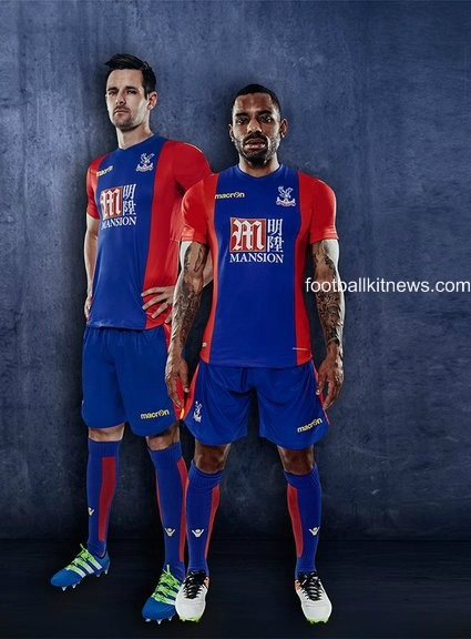
Aberdeen and Crystal Palace both have one good shirt and one terrible shirt this year, in the case of the highlanders it’s their subtly classy away shirt, while the Eagles’ home strip is a boldy adventurous take on their usual red and blue chicanery :

Last season’s overall winners for their highly original “blue moon” away shirt, Manchester City, are to be applauded for their stylish new Nike effort in sky and white. Taking the template first used for international sides in the Euros, the strip actually works more effectively in club football where there are less formal rules and traditions for kit design than with national teams. Those familiar mid-blue sleeves are much more pleasing on the eye when paired with the sky blue of City than the stark white of England. The socks offset the ensemble rather than clash with it and the result is a much more co-ordinated look :
 Moving away from the Premier League and the multinational sportswear giants, we next visit little old Barnet of League 2 and their highly creative collaboration with German firm, Jako. Though a big manufacturer in their own right, in terms of football the company is only really known in mainland Europe and produces kit for a number of other sports including handball, basketball and volleyball. What they’ve done is to rework the image of the club by bringing out four shirts that can be interchanged with various combinations of shorts and socks, so it’s more of a complete collection than just one or two options.
Orange and black remain the main two colours, with white the usual away pick, but the unique striped sash effect allows the club to uphold its traditions while at the same time looking to the future. It’s highly innovative and extremely effective :
 In almost exactly the same vein, Bradford City have come up with a similar concept and again allow for the interchange of shorts and socks to create several different options depending on who they’re playing. What makes them stand out even more is the brilliantly simple twist of using diagonal rather than the more traditional vertical stripes or horizontal hoops. I’ve got a feeling these kits will divide opinion, but personally I think they are amazing :

MUST TRY HARDER
Having already seen some shockers, this next batch truly stinks ..
Under Armour are a relatively new manufacturer with a hard-earned reputation across the pond, but if their initial efforts both last year and this are anything to go by, they really need to take a look at what’s expected of a football kit in Europe. Their efforts for both West Ham and Spurs have been poor, in particular the former’s away shirt and the latter’s home strip, both of which sport a weird, curtailed collar. It makes the shirts look like they’ve both been repaired by your mum in 1974 :
 Neither are as bad as the next four efforts.
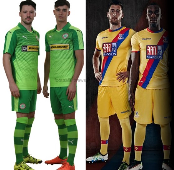
Crystal Palace go from the sublime to the ridiculous with their lazy attempt at an away shirt. You can see the thinking : “generic yellow second strip .. doesn’t clash with anyone .. need to inject that touch of Palace .. how about our famous blue and red sash ?”
How about not ?
As for Sunderland, unless proceeds are going to charity there’s never any reason for any club in the world other than Palermo to wear pink shirts. But pink and purple ? Hell yeah !
Cliftonville can get away with two shades of green to an extent because they’re Irish, but they can’t get away with it completely if the result is a proper shocker. Their latest strip is just blinding .. in the traditional, non-slang meaning of the word. The same thing can be said for Borussia Dortmund most seasons, but at least their day-glo outfits are usually nice and simple. 2016-17 ? Let’s add both pinstripes AND thick bars here and there .. yeah, that’ll work :

THE BOTTOM 5
If you thought that last selection was bad, wait till you see the next five.
These are the worst of the worst. The real head-scratchers. The proper “Why did you pay fifty quid for that ??” jobbies. The one present you DON’T want under your tree this Christmas, not when I could have a nice club onesie instead ..
#5 MIDDLESBROUGH HOME
Like a prom-queen who’s sash has slipped …

#4 AJAX AWAY
The last summer t-shirt on the rack .. in Aldi

#3 SOUTHAMPTON HOME AND AWAY
Like hideous Siamese twins that can’t be separated .. Under Armour again

#2 DERBY COUNTY HOME
Schoolboys with rucksacks .. and Will Hughes looks about 12

Just when you thought it was safe to go back into Delia’s kitchen ..
It couldn’t possibly be any worse than last year, could it ?
They haven’t, have they ?
They bloody have .. they’ve only gone and done it again.
They don’t even need it !
For two years in a row, I give you the one .. the only ..
#1 NORWICH CITY THIRD

THE TOP 5
This is it. The elite. The finest football fashions this side of a Hoddle and Waddle 12″ picture disc .. the top 5 football shirts of the season, 2016-17 :
#5 ROMA AWAY
The Italians are dominating this year, and why not with that glorious Nike template co-ordinating so well with club colours :

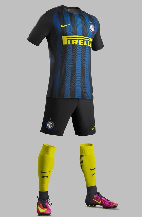
#4 INTER MILAN HOME
The glorious marriage of sock and logo, logo and sock .. not sure about those boots though
#3 ROMA HOME
A top five double for Roma with this superb club classic :

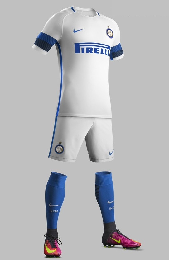
#2 INTER MILAN AWAY
And another for Inter with this breathtakingly simple creation :
Football is a simple game, an elegant game and it’s very essence is all about balance.
The right balance of the team, of youth and experience, of guile and tenacity, of vision and anticipation.
And so it is with a good kit, a strong kit that will be remembered as a classic not just for any achievements by the team that wore it – most clubs never win anything, remember – but also for what it stood for : the timeless embodiment of a club, of a group of people, of an entire community. Of you.
Sometimes, as in the Euros, the component parts are there – that Nike template, the national colours – but they’re as poorly put together as an England team. Occasionally a plucky upstart will come along and surprise everyone .. you know where I’m going with this.
Sometimes, one of the traditional powerhouses will come through and finally earn a place at the highest table. This season, a weird but strangely wonderful design has won through, though it was also ridiculed above for a poor choice of colours.
Like those Nike strips in 2nd, 3rd, 4th and 5th place, everything just seems to work right with this particular club. It just clicks ..
Without further ado, I present to you the best kit of the season, 2016-17 :
#1 IPSWICH TOWN HOME


