
Well, it’s that time of year again … the start of a new football season.
There’s nothing quite like that heady mixture of hope and optimism as you scan through the fixture list whilst keeping an eye on your club’s transfer news and waiting to see what abomination your favourite players will be forced to run out in this year.
Here’s what’s happening on the kit front …
Retro Classic
Let’s start with a few winners, shall we ?
It’s easy to laugh at the lamer efforts, but sometimes designers get it right, balancing a blend of thoughtful traditionalism with a sprinkling of modernity.
Take for example, the beautiful new AS Monaco strip:
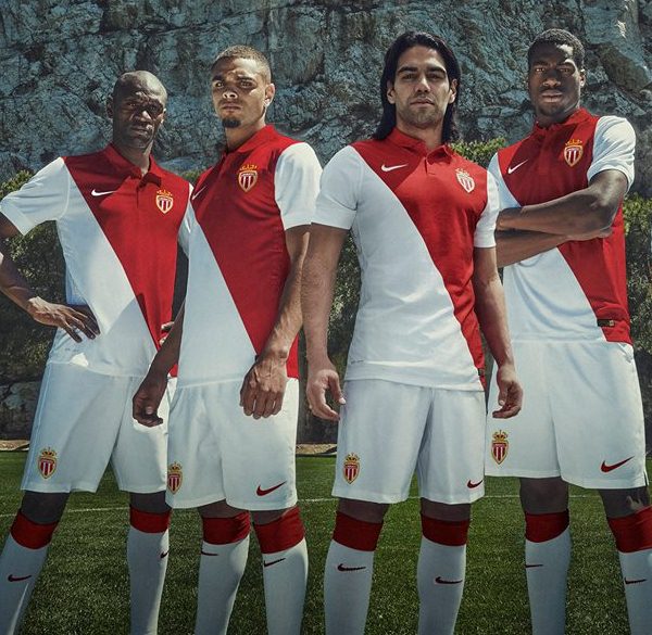 Nike have got it spot on here: just a classic reworking of an already iconic kit.
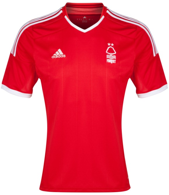
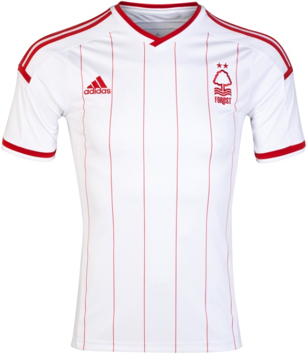
Similarly, Nottingham Forest have gone back to their European glory days with both their home and away shirts:
 Adidas have come in for a lot of stick from English supporters in the last couple of seasons because of their constant fiddling, especially with a club’s traditions but also because most of their kits are largely generic, using the same template time after time. There’s still an element of that this year, but it looks like they’re upping their game and taking the criticism seriously with most of their work for next season.
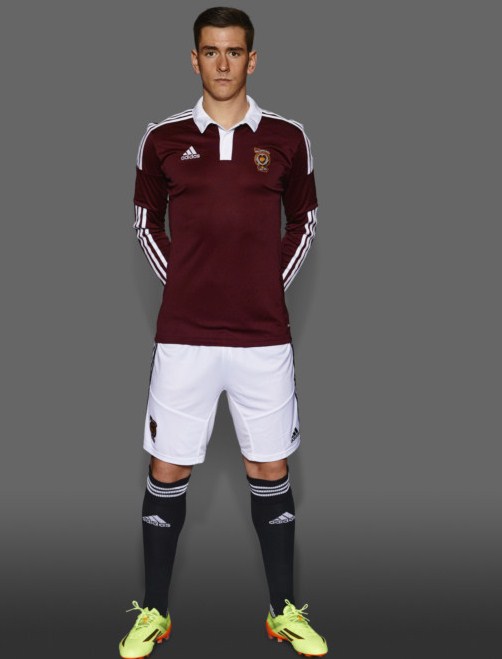
One of their better retro designs is Hearts, those black socks really setting it off:
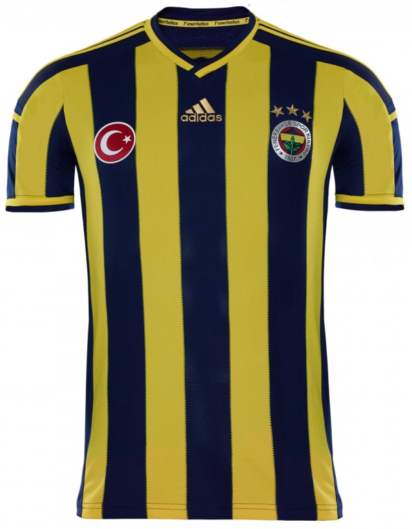
 Fenerbahce‘s is pretty cool as well:
 Umbro have been rolling back the years with their new design for the 90th anniversary of Peruvian side, Universitario de Deportes:
 Those famous diamonds haven’t been seen in while.
Slightly more restrained, but nonetheless equally classy is the new Hull City strip, also by Umbro:
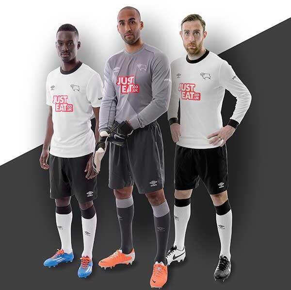
 … while their 2014-15 Derby County kit looks like it’s come fresh from the early 70s:
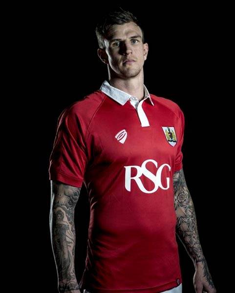
There’s been a spate of new manufacturers springing up of late, with a lot of them being in-house designs farmed out to far-eastern manufacturing plants. AS Roma started the trend a couple of seasons ago in an effort to save money and create something a little different, and now Bristol City have got in on the act with their own “Bristol Sports” subsidiary. Managing to keep “BS” from featuring in their logo shows they’re clearly thinking along the right lines and their first product looks the business too:
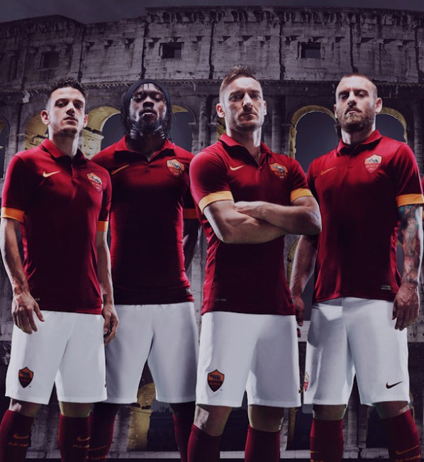
Speaking of Roma, they’ve actually signed a new deal with Nike but it’s clear they’re sticking to the principles of classic kit design:
The Chevron
Now I like heraldry as much as the next knight of the round table, but there comes a time when you just have to say “No, sire – thou shalt cease and desist with thine overuse of what was a comely template and give us something new!”
I blame Lille. The French club had a chevtastic design the year Joe Cole signed for them, but now everyone’s doing it … they’ve even done it again themselves:
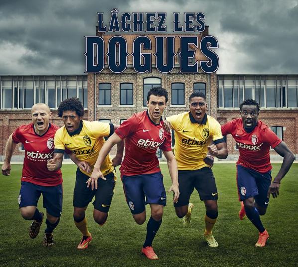
There’s a three-colours red triangular design based around the collar, spreading down across the chest and it’s alright … I mean, it’s not offensive or poorly designed but I can’t help thinking they should move on now.
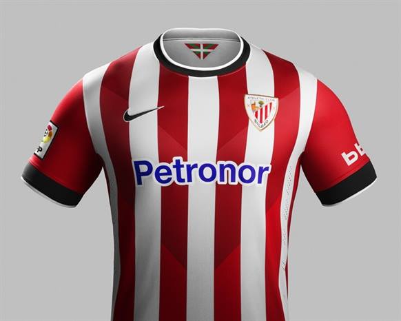
… especially when you see what Athletic Bilbao have done with the idea – you can’t have stripes AND a chevron !
 But fear not, mediaeval-lovers for there is hope for us all yet.
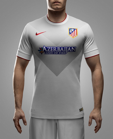
Champions of Spain, Atletico, have a new away shirt and it is an understated beauty, while the South African side Mamelodi Sundowns have also released a cracking chevron-based second strip:

Sponsors … how much room do they need ?
We’re lucky in England – there are very strict limits on the size of any logo on our clubs’ shirts. What’s more, they can only display one on the front of the kit, with the Football League also allowing a smaller secondary sponsor on the back.
Across the channel, anything goes when it comes to sponsorship … just look at this abysmal effort by Montpellier, normally classy and highly original with their kit design:
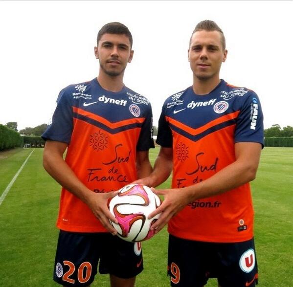 It looks like the players have been doodling on it and then decided to sign it for good measure …
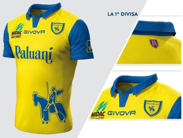
Italian side Chievo aren’t much better with three separate logos:
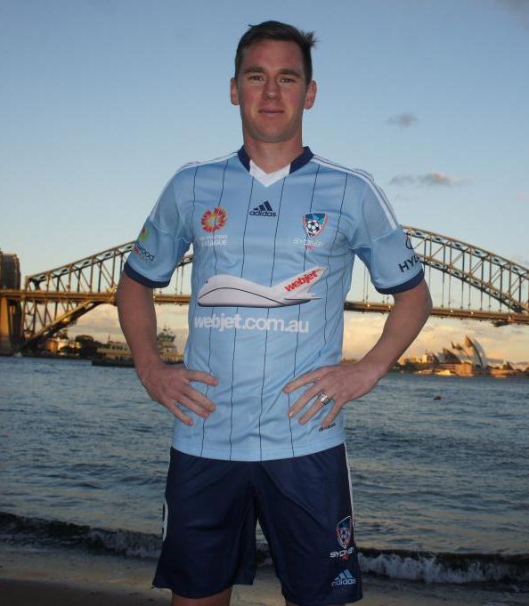
 The worst of the lot has to be A-League side Sydney FC. They appear to have no less than four logos on their new home jersey, including a child’s drawing of a jumbo jet:
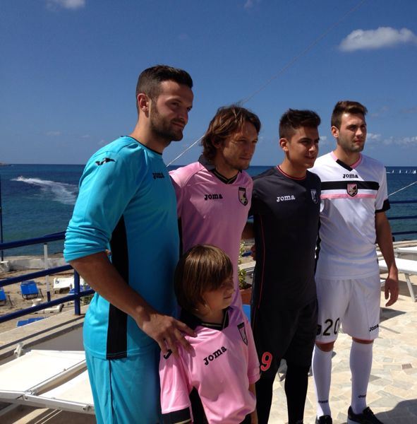
Tickled pink
I know we’re living in a metro-sexual world where men have facials and get their back, sack and crack manicured every week, but there’s only ever been one club that’s been able to pull off pink as its primary colour and that’s Sicilian side Palermo.
I mean, are you gonna be the one to go there and tell them it’s a bit … effeminate ?
The home of the mafia ?
I thought not …
Thing is, even Real Madrid have got in on the act now, adding a single line of pink piping to their shorts and the trim of their socks – not on the actual shirt, though, interestingly enough. I’ve not pictured it because it’s really no different to every other strip they’ve had under Adidas and – as with all the club strips I’ve not mentioned – it’s just a bit boring, really.
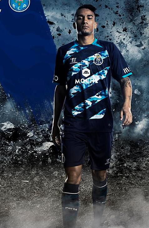
One kit that isn’t boring is the new Porto third strip (the one in the middle):
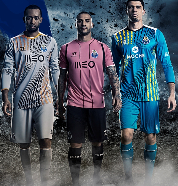 (incidentally, I think the other two are their goalie shirts for next season as the home strip is a fairly generic blue and white stripes number, while the away kit I’ve saved for later – make sure you’re sitting down for that one, though).
Another pink third kit is Cessena‘s, shown here with the rather dull white home and blue second kits:
 … and just for the sake of completion, here’s the original – Palermo 2014-15:
Interestingly different
Some kits are neither good nor bad, but just unusual or quirky. Sometimes they become rather iconic (think Peru), and sometimes they’re best forgotten (think Coventry’s brown away strip). This is a potpourri of sorts … you decide if you like them or not.
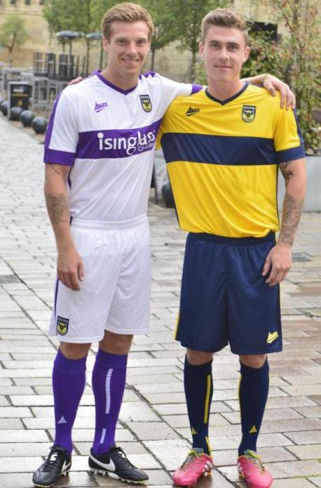
Oxford United (away white, home yellow):
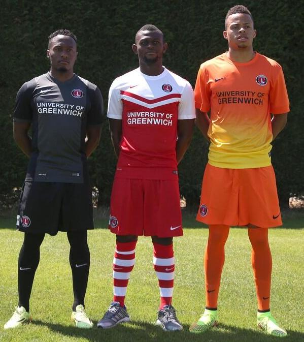
Charlton Athletic (L to R away, home, 3rd):
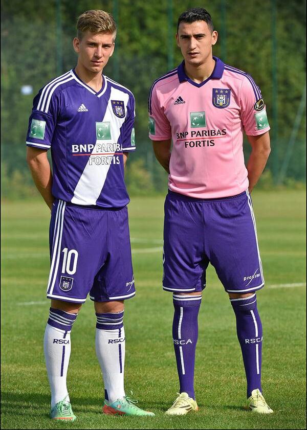
 Anderlecht (purple home, pink – again – away):
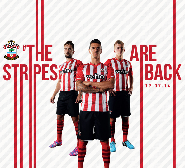
 Southampton (those socks – what were they thinking ?):
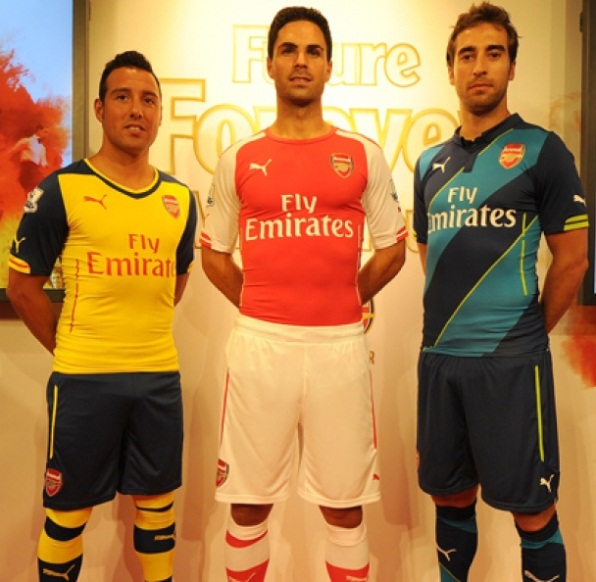
 Arsenal (away, home, 3rd):
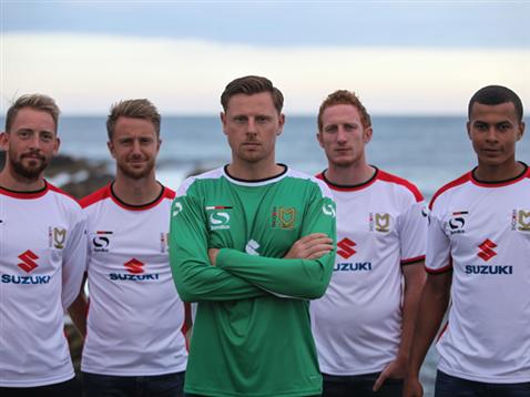
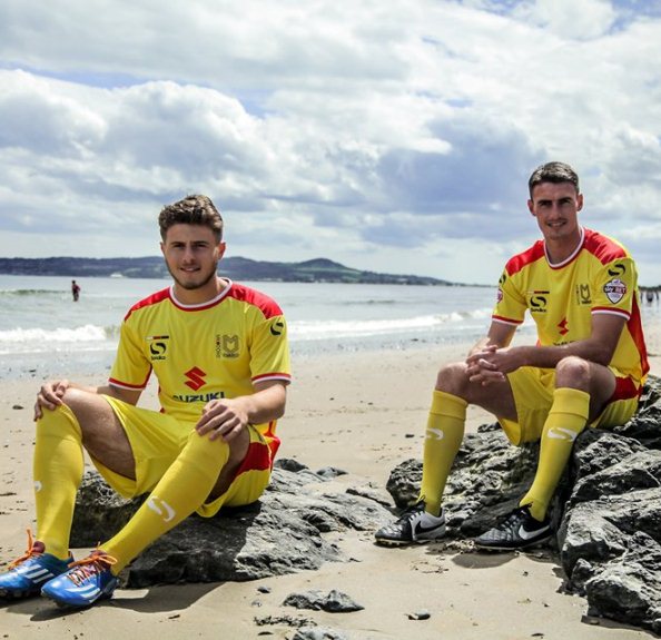
 … and then there’s MK Dons. It’s not so much the kits – they’re rather bland if you ask me – but the setting for the launch ? Just about the most distant club from the sea you can get in England … and they filmed it on the beach ?
It’s getting ugly
Before we move on to the best and worst kits of the year, let’s take a look at some of the contenders for the latter honour …
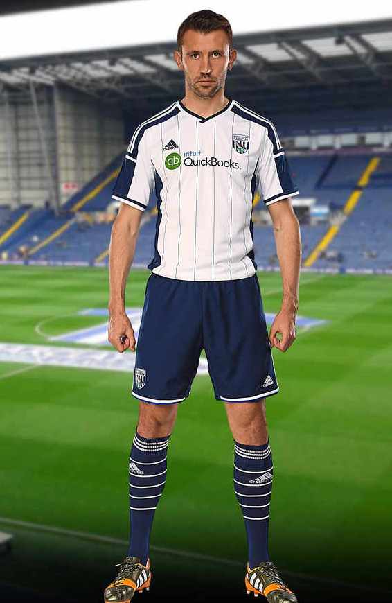
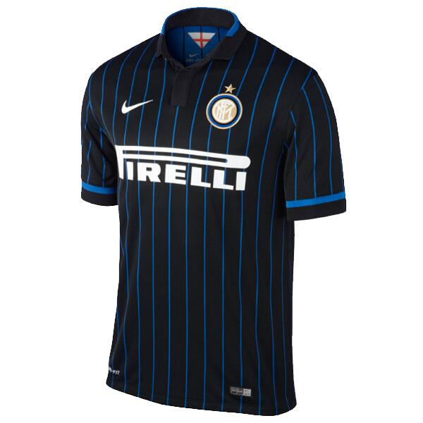
More examples of Adidas mucking about with tradition: WBA and Internazionale, both of whom normally wear proper stripes (and yes Saints fans, I know they did it to you too)
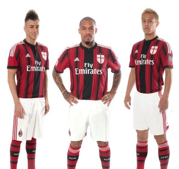
 Both Milan clubs have been stitched up, though … here’s AC‘s new home
 kilt sorry, I mean kit:
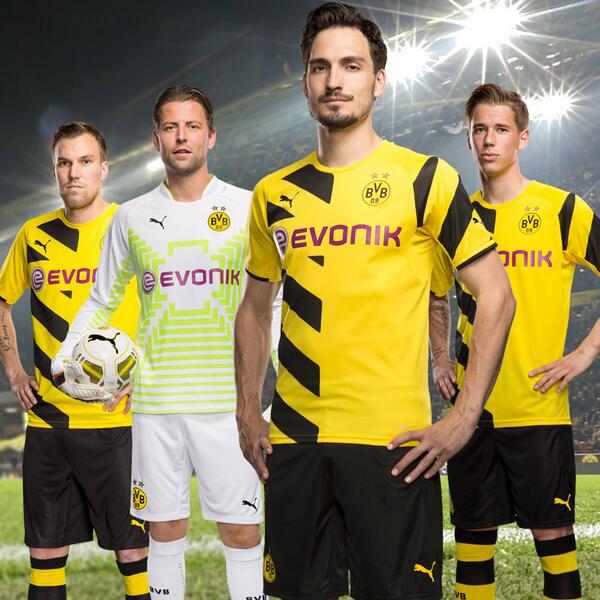
 Dortmund have never, ever had one single decent kit, largely because the only type of pen their designers are allowed to play with is a yellow highlighter and this year is no different (though I do like the idea of the target on the keeper’s shirt – I think that might catch on):
 Newcastle United are not a dull club. They should never be forced to wear grey:
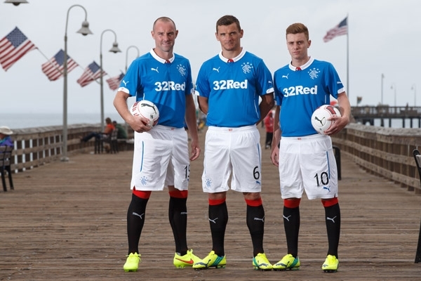
 Speaking of colours that are just wrong, what’s happened to Rangers’ famous royal blue ?
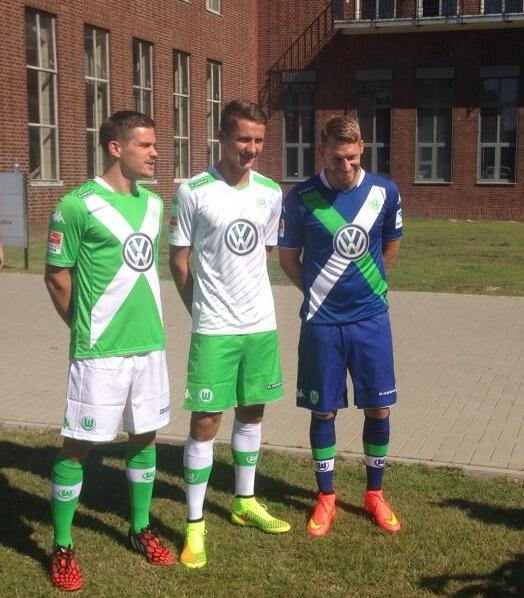
Wolfsburg can’t seem to make up their mind as to whether they’re Irish, Scots or .. er .. German:
 Wimbledon are going back to the 70s with a new mascot and a horrible effort by Admiral, who couldn’t even be bothered to line up the stripes on the collar with the rest of the shirt. Shoddy :
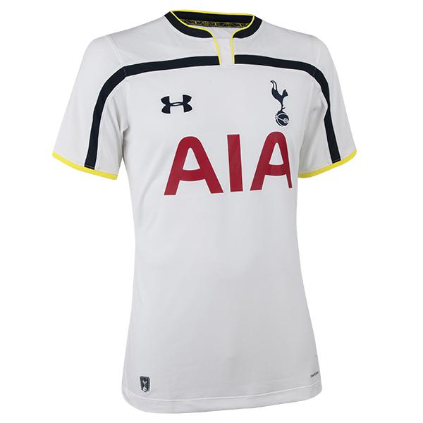
 Tottenham (home) and Liverpool (away) have gone a bit stripe crazy with these two efforts:

Bringing up the rear and very nearly making it into the bottom five is the afore-mentioned Porto away strip, which quite frankly beggars belief:
You’re almost the best … better than most of the rest
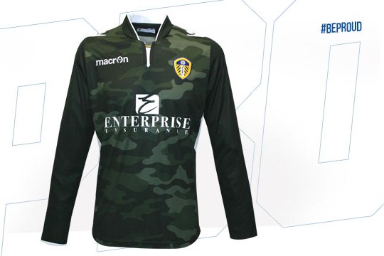
… and yet, sometimes a good camo pattern can work. This Leeds United goalkeeper’s shirt is fantastic:
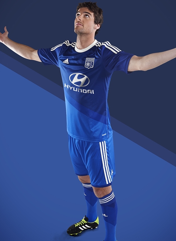
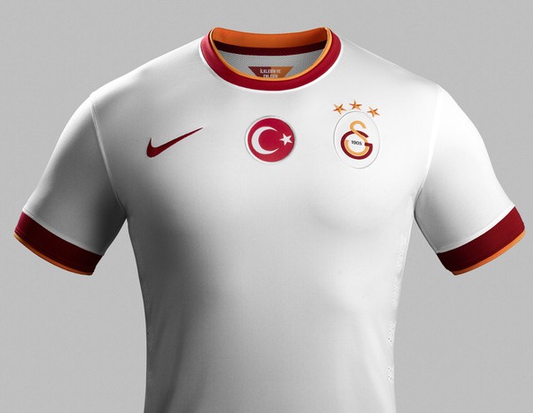
 Other great designs for this year include away shirts from Juventus, Lyon and Galatasaray:

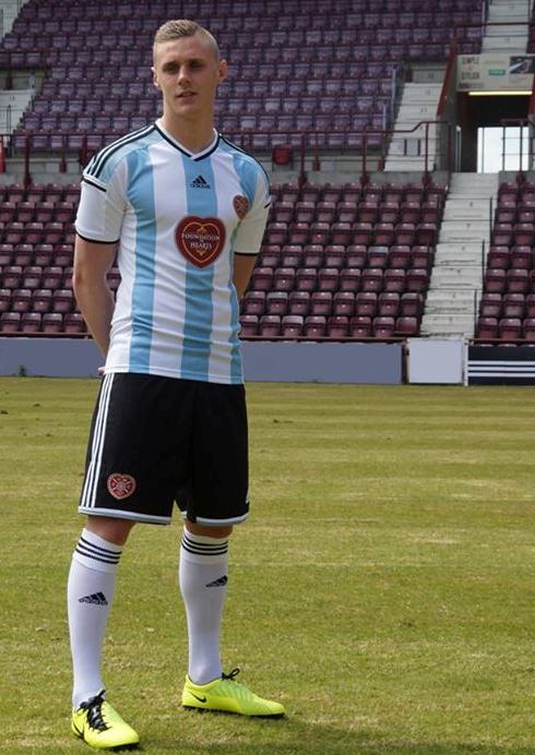
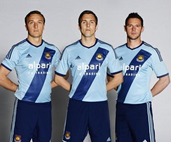
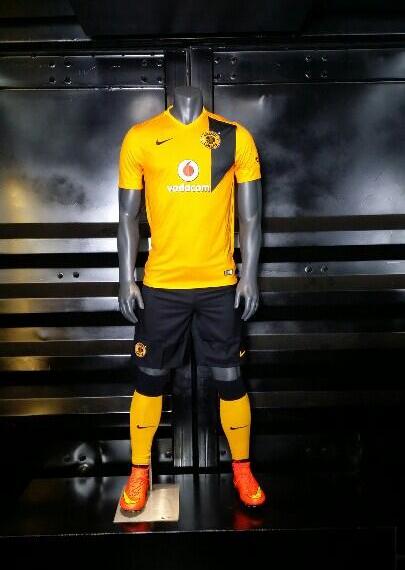
 Other cracking away kits worth mentioning are South African giants Kaizer Chiefs, cheeky Edinburgh club Hearts looking to trade on Scotland’s affinity with Argentina, the disinctly Californian flavour of West Ham‘s new sky blue number and the two-blue, mostly white sash shirt of Zenit:


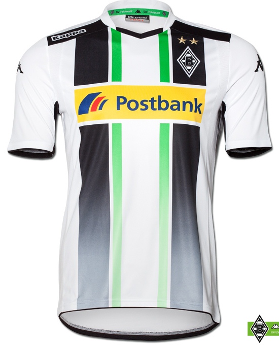
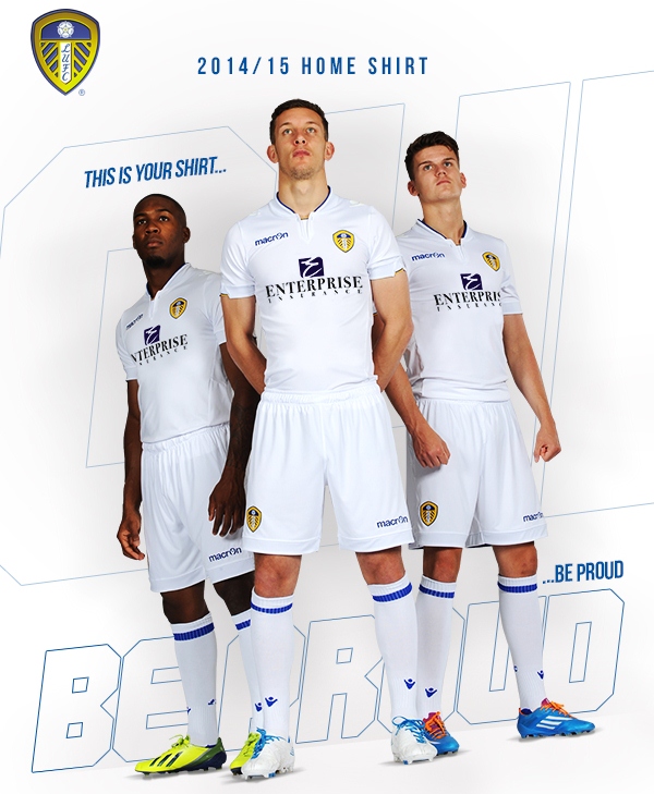
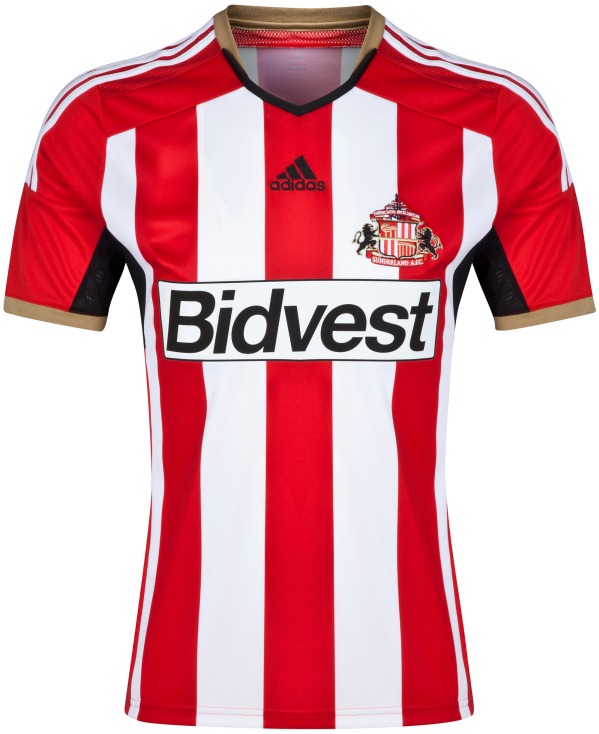
There’s also a few worthy home kits out for next year too: Gala, Juve and the Chiefs again, Borussia Monchengladbach‘s stunning new strip, Leeds back to basics classic, a beautifully simple Partizan Belgrade kit and rather surprisingly a really elegant effort from Adidas for Sunderland:


The Bottom 5:
This is it … if you thought some of the kits you’ve seen already were bad, be prepared for the worst of the worst.
Without further ado, I give you …
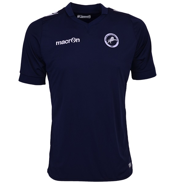
#5  St.Mirren home:
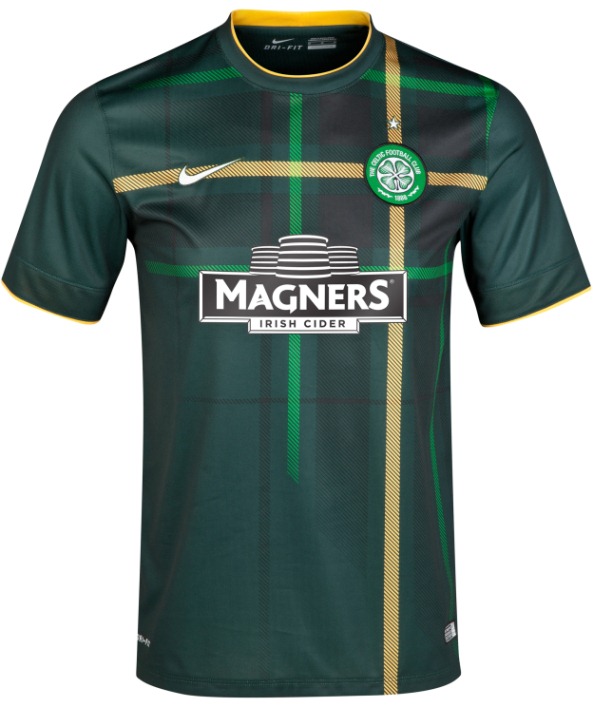
#4 Celtic away:
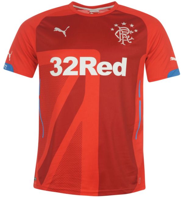
 #3: Rangers away :
 #2 Girondins de Bordeaux home:
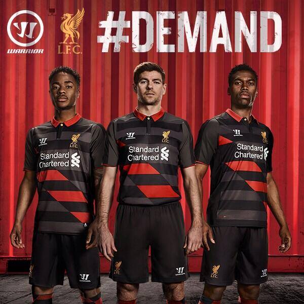
 #1 Liverpool 3rd:
The Top 5:
The best clubs kits of season 2014-15 in ascending order of merit are …
#5 Millwall home – plain and simple, the way a football shirt should be:
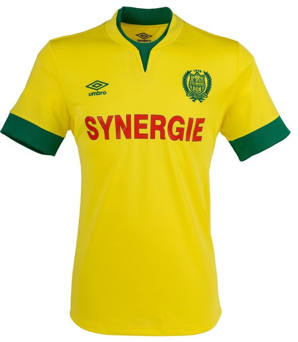
 #4 Nantes home – again, a timeless, elegant simplicity:
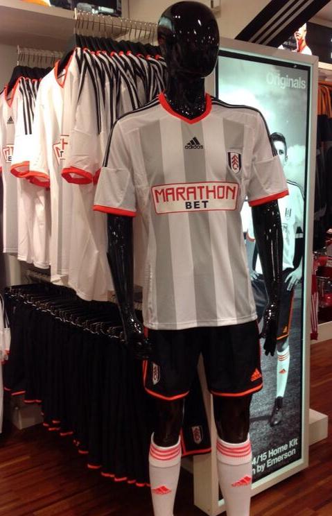
 #3 Fulham home – a bold and daring redesign for a club entering a new era … and I think they pulled it off:
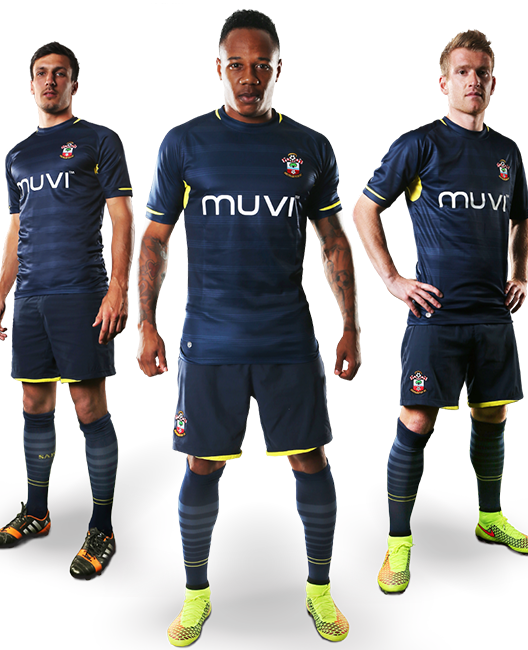
#2 Southampton away – an absolutely stunning effort, especially for an in-house design:
#1
THE BEST KIT OF THE YEAR
Lens away – fantastic colour scheme, gorgeous, unique finish and even with a really dodgy sponsor it still looks classy:

There is one more I’d like to talk about, if you don’t mind.
A couple of seasons ago, my club Leeds United released a launch video that was part teaser, part Henry 5th and part soft porn as they unveiled their ultimately rather boring new home strip, complete with stirring voice-over from Neil Warnock.
I thought that could never be topped, either for artistic license or sheer nerve.
… but I was wrong.
This video is, quite simply, stupefying.
I still can’t figure out if it’s sheer genius or absolute lunacy, but either way it’s got everybody talking and as they say there’s no such thing as bad publicity.
This is the new Blackburn Rovers home shirt launch video:

