
NEW SEASON FOOTBALL KIT ROUND-UP 2015-16 – part 1
It’s that time of year again when optimism abounds and stupid bets are placed : the new football season is nearly upon us and we’re all a bit giddy, including the kit designers if this year’s crop of shirts is anything to go by ..
Without further ado, let’s delve into the dayglo world of football fashion !
GOOD EFFORTS
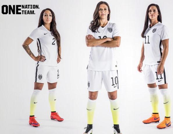
Getting us off to a positive start is USA Women. It’s been a great year for women’s football with a cracking World Cup in Canada and attendances up across England, while over on the other side of the pond they came up with graduated sock colours – what a great idea. There’s a lot of colour blending going on this summer as technology marches ever onward :
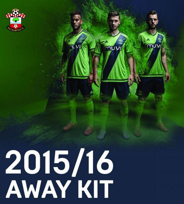
 Sashes are very much back in vogue this season, following a few experiments over the past couple of years. Here’s a quick run-through of some of the best, starting with Southampton‘s new green away strip, as modelled here by Saints fan Christopher Burrows:

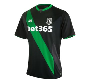
Stoke City‘s effort is quite similar, though they’ve paired black with a garish shade of green for a highly original look :
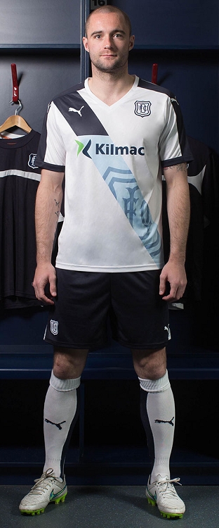
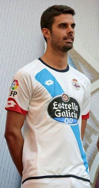
Dundee have gone for a novel approach, merging the club badge with the sash itself, while Spanish club Deportivo have kept things simple :
Instead of graduating socks, Norway have blended the main shirt colour into the sash for this cheeky little number :

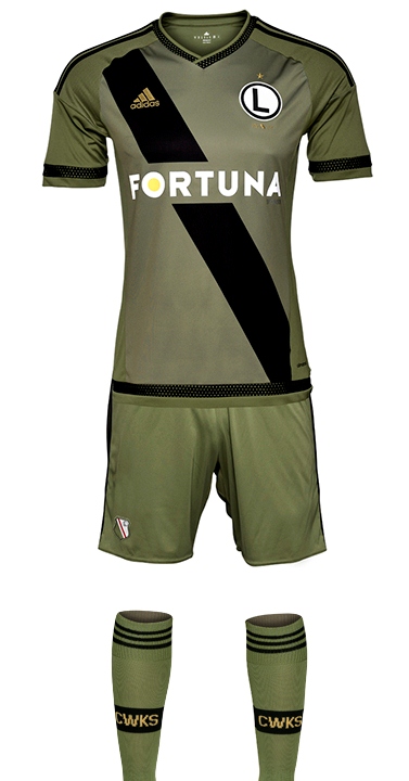
Polish giants, Legia Warsaw, have gone for a militaristic olive drab away kit with just the one detail, a dirty great black sash like a camouflage stripe across the face. I don’t know why, but it just works …
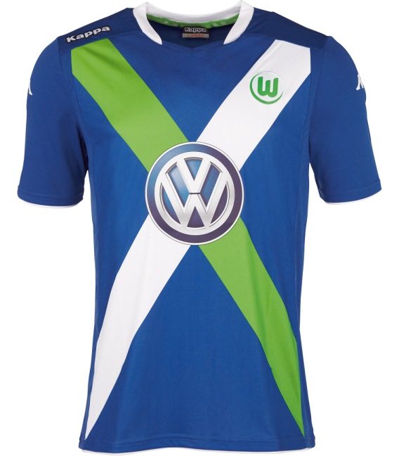
Meanwhile, over in Germany Wolfsburg have been getting greedy adding TWO sashes to their new 3rd strip. Not sure about this but it is highly original so I guess it’s a positive move :
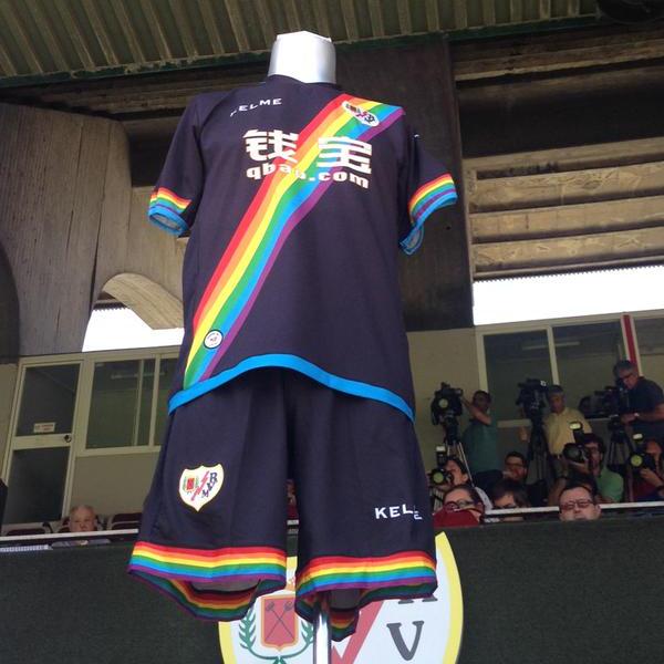
Rayo Vallecano are one of a host of clubs with charity strips this year. I don’t mean they’ll be taking their clothes off for money, rather that a percentage of profits from shirt sales goes toward good causes like fighting cancer and anti-racist, anti-homophobe and anti-sexism movements across Europe. The rainbow colours are in evidence elsewhere, but their change kit is the best example in my opinion :
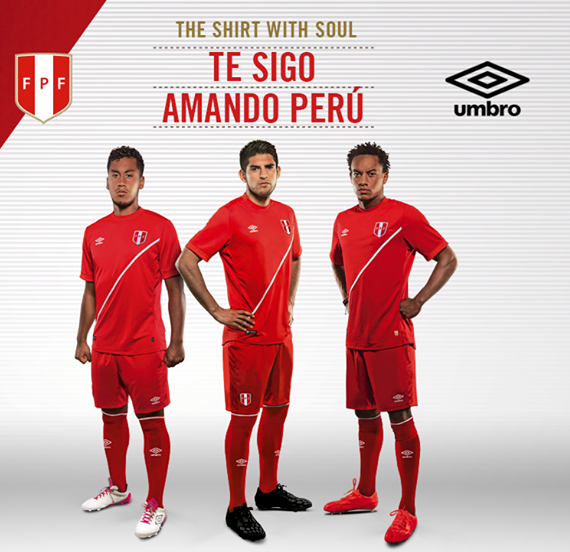
 Lastly and perhaps most appropriately as they have always sported an iconic red stripe across their white home shirts, we have Peru with their subtle new away kit :
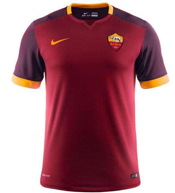
 Back to basics now, with the new Atletico Madrid away and Roma home kits, both based on the same Nike template and both highly effective. Sometimes, less is more …
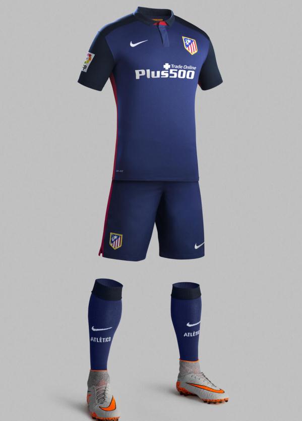
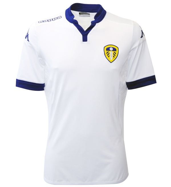
Also with classic new looks come Leeds United and Bristol City, both with a bold and simple approach to shirt design :

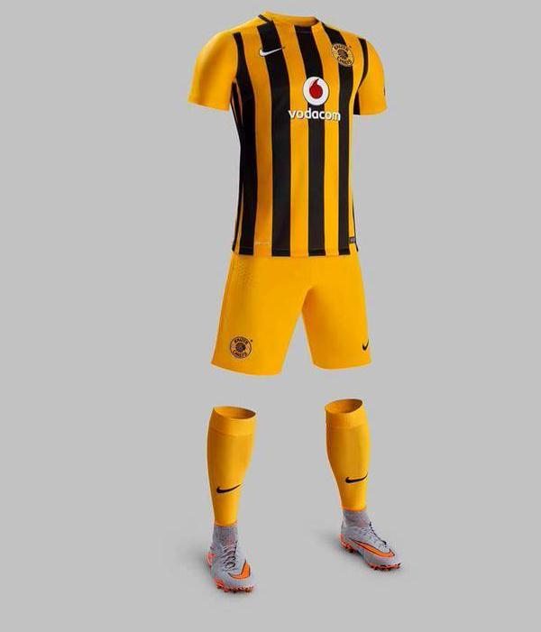
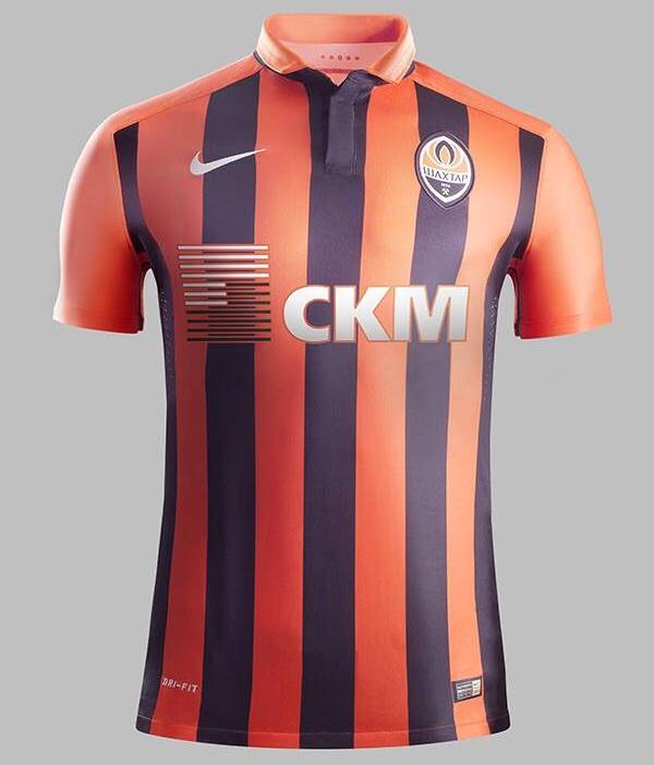
Stripes are in evidence elsewhere, none finer than those at South African club, Kaiser Chiefs, Ukranian Giants Shaktar and good old Crystal Palace who, aside from having a very productive close season on the signing’s front, have come up with a beautiful new away strip :

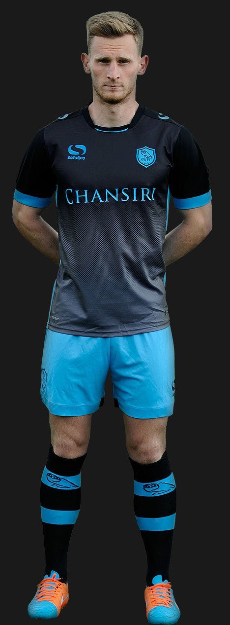
Back to the colour blends and here we have Schalke’s new 3rd kit, Sheffield Wednesday away and Bournemouth’s stunning new stealthy change strip: 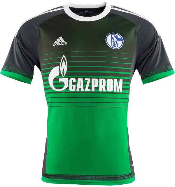

In terms of originality, Kilmarnock away is gonna be hard to beat what with a highly unusual combination of colours and that swirly strip curling round the torso :

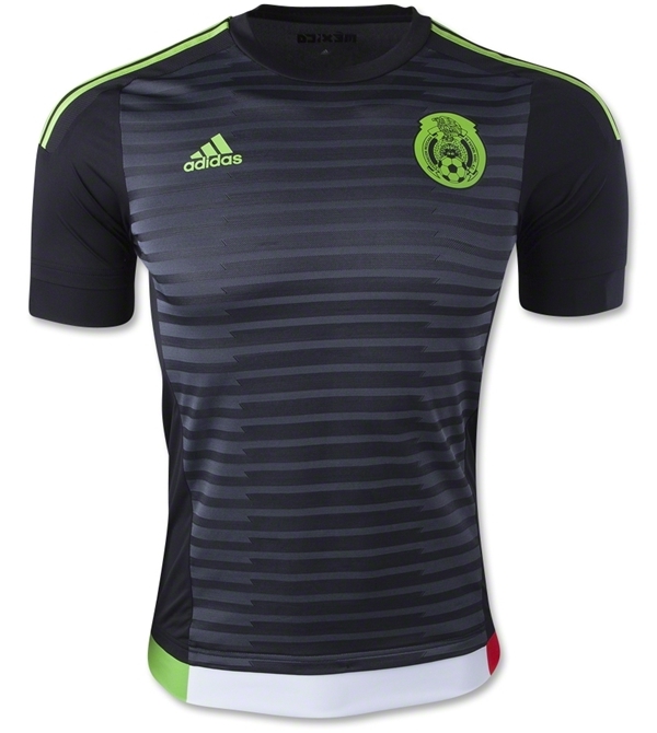
Lastly, and only just missing out on the top table itself, Mexico’s breathtakingly gorgeous new away strip – aye caramba !
 PURPLE REIGN
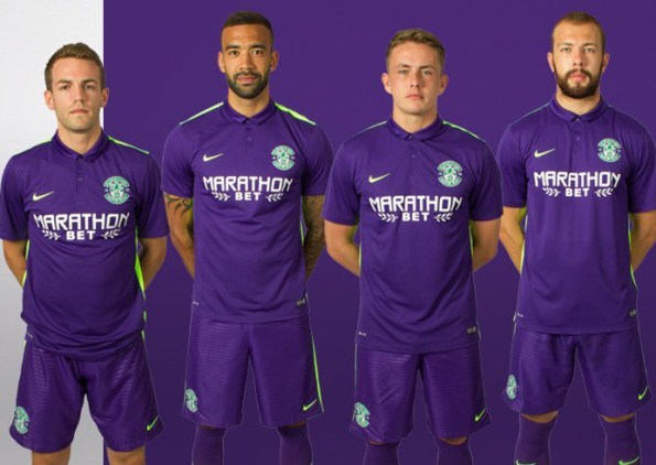
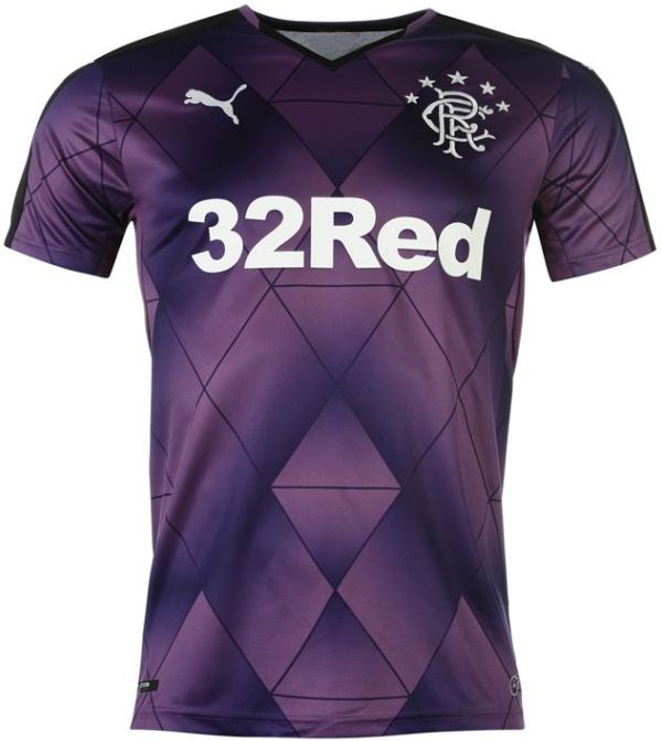
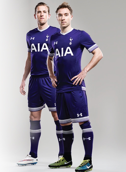
Black is right up there in terms of the colours being used this season, but the biggest shocker is the sudden proliferation of purple. I’m beginning to wonder if the collected design teams of Nike, adidas, Umbro and the rest aren’t all based in Florence ?
First up are Hibs, Rangers and Spurs, all with new away shirts :
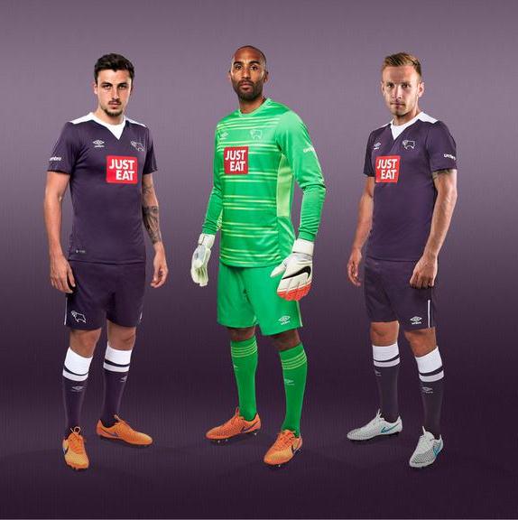
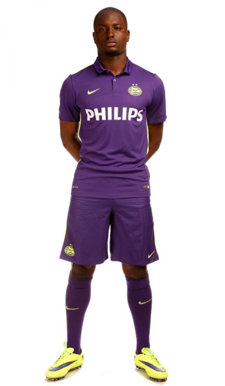
Derby County and PSV make better attempts, though the Derby sponsors let them down:
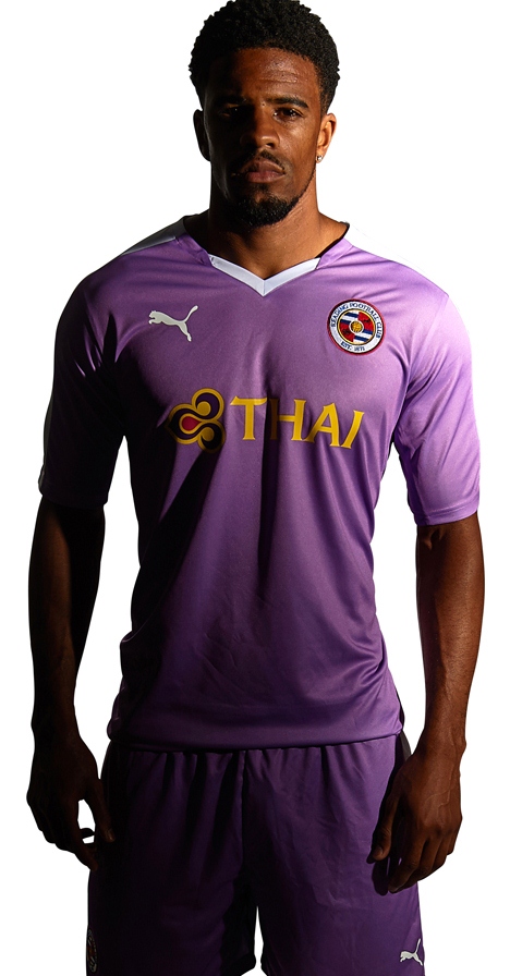
But pride of place must go to Reading for using the hitherto untouched shade African Violet (as worn by Loughborough University sports teams). This oozes class :
SPONSORSHIP OVERKILL
Every year the over-zealous use of sponsor logos ruin otherwise perfectly acceptable shirts, with French clubs being amongst the worst offenders. It seems there’s no limit to the size or number of the damn things adorning the kits of Ligue 1.
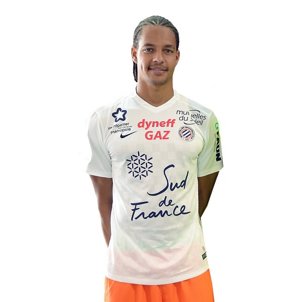
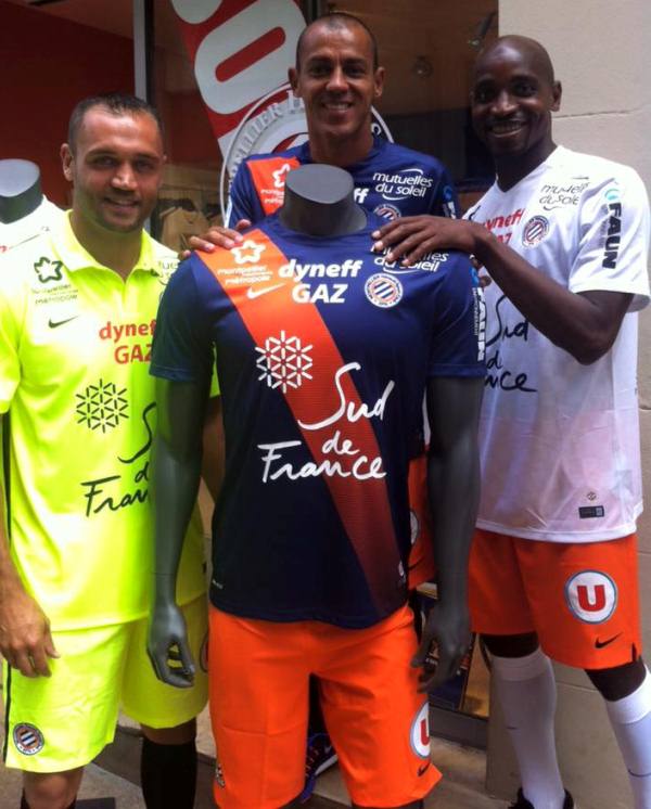
Take a look at serial offenders Montpellier who just don’t know when to stop, year after year …
Then there’s Evian.
Okay, we get it .. you’re sponsored by the water company. Get over yourselves :
 Bastia are no better, nor Guingamp:


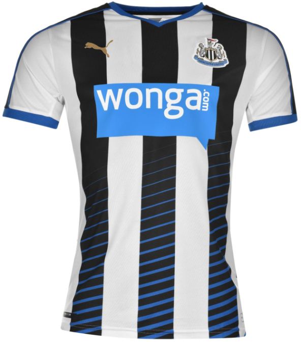
This trend has even begun to creep in over here. It’s not so much the size but the choice of the sponsor in question. One obvious starting place is Newcastle and their despicable promotion of pay-day loan company, Wonga :
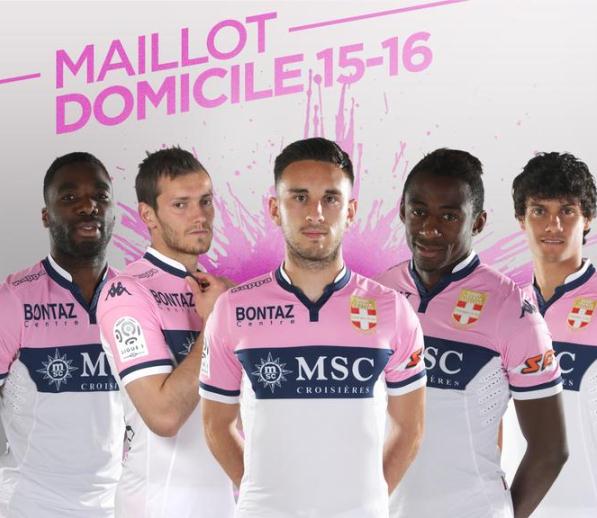
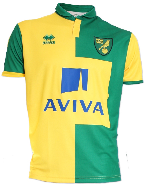
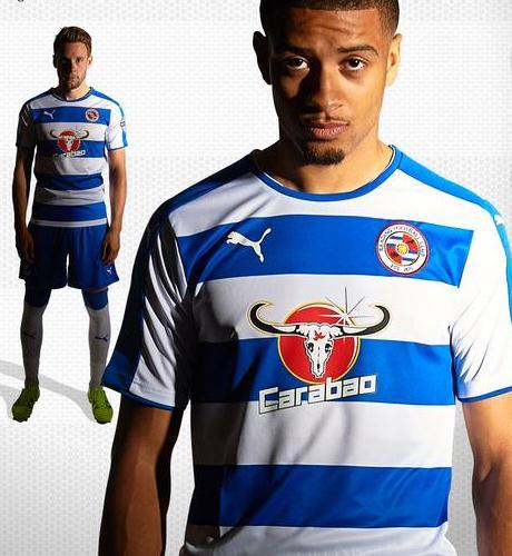
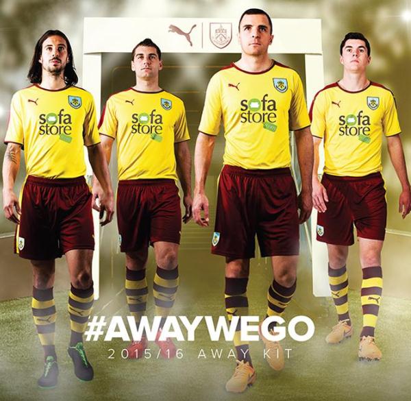
Norwich, Reading and Burnley all suffer too, but mainly because their sponsors are either naff or ruin the look of the kit .. or both:
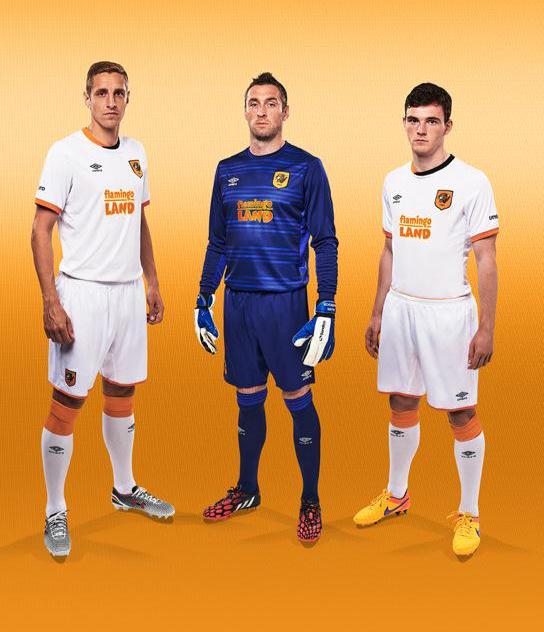
Having said all that, there can be no sadder example of a naff company partnership than Hull City and Flamingo Land. Just look at Michael Dawson’s face in these two pictures. Surely the man can sue on the grounds of a loss of dignity alone ? :

 IN PART TWO :
Retro new shirts, the worst kits of the year and the top 5 new strips …. it’s all here

Pingback: NEW SEASON FOOTBALL KIT ROUND-UP 2015-16 – part 2 |
Saints fan Chris says: I look great, and great blog post.
Nice one, Chris – thanks for that !
Good luck for the season 🙂
Thanks Chris, a smashing read and very informative.
Who’s Chris ?
Thanks anyway !
Paul