NEW SEASON FOOTBALL KIT ROUND-UP 2015-16 – part 2
You’ll find part 1 here
RETRO BUT NEW
Before we get low down and dirty looking at the worst kits of the year, let’s take a stroll down Retro Avenue.
Every season, various clubs try to evoke their glory days by coming up with a “brand new but old” version of their team colours. Some are to commemorate centenaries or other historic milestones, others the anniversary of a famous league or cup win, while yet more are just because there’s only so many variations on a theme possible when it comes to a football strip. Like the real fashion world, everything’s cyclical. I just hope we never go back to “short shorts” any time soon …
First up in this section is the simply magnificent new Nottingham Forest home shirt: what a Bobby dazzler this little number is. With gold trim to celebrate their 150th anniversary, adidas have come up with an instant classic :
 Another adidas creation that hits the right tone is the new Man United home shirt which harks back to the days of Mark Hughes volleying in from mid-air while seemingly defying gravity, while the company continues in the same vein with this year’s WBA kit, dropping the pinstripes much to the delight of their fans :
Other stripey success stories come in the shape of Juventus and Porto, both with classic designs :


Everton and Swansea are both very much on a retro tip this season, too – the Toffeemen with a classic white v-collar and white socks to bring to mind their glorious all-conquering 80s team, while the Swans also feature that gorgeous gold trim on offer from adidas, albeit slightly let down by an overly-fussy sponsor spoiling it somewhat :
Meanwhile, down in the South African Premier League, both Mamelodi Sundowns and Orlando Pirates have dipped into the past to rework their most famous strips. Two stone cold classics right here :


Being a self-confessed Subbuteo nut, I can’t help but wax lyrical about the new Birmingham City away shirt. I say new .. this design first saw the light of day way back in the days when Trevor Francis and Bob Latchford formed a deadly duo up front. The Subbuteo version is worth a fortune now, easily more than two or three of the real thing available from the club shop :
 SHOULD DO BETTER
And so we come to the worst kits of the season …
Before we name and shame the ultimate losers, let’s take a trawl through the murky backwaters of mediocrity and check out some of the contenders that didn’t quite make the bottom 5.
I know it’s a game of two halves, Brian, but why oh why do halved shirts keep coming back, year after year ? Blackburn, yes – it’s acceptable because it’s traditional. Genoa and Basle, too, and for the same reasons. But anyone else should avoid this, the clunkiest of footballing fashion faux pas.
It’s even worse if there’s colour blending going on as well. And I mean chunky 8-bit done-on-a-Spectrum type blending, not the sophisticated, subtle tones we saw in part 1.
Huddersfield Town should hang their heads in shame for this awful away effort, while Johnny-come-latelys Crawley have somehow managed to combine a dreadful design, a second-rate sponsor and a cheesy photo session with their new home strip :
Irish club Glentoran have given it a good go, but they’re “peas and ketchup” combo is just too harsh on the eyes to ever be enjoyed, while bonkers Turkish outfit, Galatasaray, have gone completely gaga with their latest home kit. Have you ever seen odd socks on a football strip before ?
My eyes hurt after looking at the next few.
I don’t want to waste time describing them in detail .. let’s just all see if we can get through this as quickly as possible, shall we ?
Deep breath … Grimsby away, Exeter third and Bradford home :
… and another breath, then it’s Borussia Monchengladbach away, Swansea away and the new Preston home kit, which is basically a plain white Nike t-shirt … that costs £50.
Even Neil Kilkenny looks embarrassed and that takes a lot ..
Don’t worry – we’re nearly through .. here’s what could’ve been a classic second strip, completely ruined by a botched sash. Welcome to the new Rangers away :
 Two quickfire horror shows from Carbrini now in the form of Walsall away and Ross County home. These are real shockers – way too fussy and fiddly and retro in a completely terrible way :


Then we have what may well be a geographical anomaly – the new Central Coast Mariners kits (plural) that can only be explained in the same way that Australia produced the kangaroo and the duck-billed platypus, namely by dint of pure isolation :

Spare a thought for Barcelona fans, folks. Actually, don’t : they get to watch Messi every week. They can suffer in this horizontal horror show .. why did they do it, just why ?
They look like they wanna be QPR !
 If you want to spare a thought for anyone, make it the Hoffenheim goalkeepers next season. They’re wearing Jackson Pollocks – or at least that’s what it rhymes with :
THE WORST FIVE SHIRTS OF THE SEASON
I think I actually enjoy this bit better than the Top 5 personally, but here goes.
In reverse order, I give you the baddest of the bad new football kits 2015-16.
No. 5 – TOTTENHAM HOTSPUR home
Or “How not to make a sash design”

No. 4 – WOLFSBURG away
Or “How many colours is too many colours ?”
No. 3 – JUVENTUS away
Or “Make it stop ! Make it stop !”
 No. 2 – PORTO away
Or “I can’t wait to be a Girl Guide”
 No. 1 – NORWICH CITY third
Or “There’s no need for it anyway !”
THE TOP 5 SHIRTS OF THE YEAR
This is it – the pinnacle. The best of the best. The creme de la creme, Rodney.
It’s actually been a vintage, albeit rather extreme, year for kit design and as the technology strides ever onwards you have to wonder what’s next ? Personalised shirts featuring shadowy renditions of individual player’s faces ? “Colour-tech” to show you the mood of your left back as he gets skinned again by the opposition winger ?
Who knows … for now, these are the best new shirts of 2015-16 …
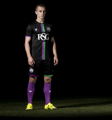
No. 5 – BRISTOL CITY away
A beautifully crafted, highly original design that proves you don’t have to team up with a multinational to get a good kit – this is an in-house instant classic from City’s own “Bristol Sports” company :
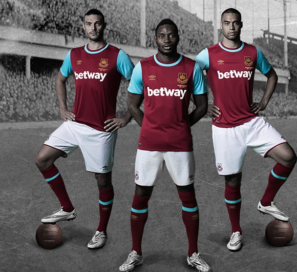
No. 4 – WEST HAM home
Things are looking up for the Hammers : a new home, a new manager, new hope and a glorious new kit. This is what a football strip should look like, all bold colours and classic features with no fiddly bits. It even encouraged Andy Carroll to be fit enough for the photo, such is it’s power :
 No. 3 – PORTUGAL away
This is breathtaking and one of the reasons why I think nobody can touch Nike at the moment. Their sheer imagination coupled with respect for the past creates beauties like this :
No. 2 – LEGIA WARSAW home
We saw the fantastic army green away version in part 1, but this jaw-droppingly simple effort from Poland’s biggest club is fantastic. It’s retro, it’s on trend, it’s classic, it’s the future. It’s adidas’ finest work this year and they’ve also had a strong season :
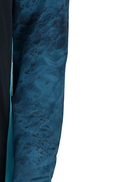
 No.1 – MANCHESTER CITY away
The “blue moon” shirt from Nike is incredible. At first glance it looks like another “stealth” strip, ie the badge is all one colour and contrasts nicely with the main strip. These designs have been fairly common for the past couple of years and the two shades of blue work brilliantly in this case. But .. look again .. look closer .. look at those sleeves.
Those are actual moon craters. A real blue moooooooooon. How cool is that ?
I love it. Hats off to you, Citizens. Wear your shirt with pride :


Pingback: NEW SEASON FOOTBALL KIT ROUND-UP 2015-16 – part 1 |